California's Great America vs. Plain Wrap
-
the Crypt Cruiser
- Gulf Coaster
- Posts: 22
- Joined: Thu Aug 16, 2007 7:37 pm
- Location: Redondo Beach, CA
- Contact:
California's Great America vs. Plain Wrap
I only get a chance to visit CGA every couple of years, because of the distance. I visited the park last weekend. I came with bigger souvenir budget, with expectations of buying alot more souvenirs than usual. Unfortunately, all the merchandise was totaly generic. Plain Jane cups and shirts all with overly generic fonts. They might as well just sell stuff that says "Theme Park" Nothing grabbed my attention or my wallet. I couldn't even find a postcard. I at least wanted something with a land mark, like Columbia or something. Their new font is incredibly boring, as is the new name. I know Cedar Fair uses that Font for all but a few of their parks. I think it's worse than the generics of the Six Flags brand. All through the park, I saw employees using old Paramount products and found my self drooling. At least Paramount had a little class and put the rock and stars on everything. CGA is still very beautiful and one of my favorites. I just wish they would overhaul the name and logo, I just lowers it's appeal so much. I always try to buy a souvenir to support the parks I visit. The only thing I walked out of there with was a "Haunt shot glass", which is identical to the one I could get at Knott's except for the little "plain wrap" CGA logo instead of Knott's. If anyone one reading is with the new Management, this is food for thought. I wouldn't buy a Target refrigerator magnet, would you?:(

-
Angry_Gumball
- Gulf Coaster
- Posts: 39
- Joined: Sun Jul 22, 2007 8:56 pm
- Location: Bay Area, CA
I've actually bought quite a few souvenirs/t-shirts from CGA. Last year's souvenir cup (bought near halloween) was pretty generic, didn't even have the park's name on it. I bought one this season (at the start) which consisted of a clear speckled cup with CGA's logo, and Firefall's logo. The whole Red White & Blue colors kinda stood out to me and reminded me of GA as it's former self. For some reason, the new logo kinda reminds me of GA's past life as well...though it's not a Slab-serif font. (What font does Cedar Fair use anyway? I'm sure it's probably something custom?)
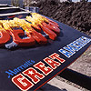
T-shirt-wise, I've collected quite a few, using a variety of fonts and designs. I wish they had some of the individual rides (besides Flight Deck, which looked odd to me so I passed). Most of them seem to have used the Old English font. I also grabbed 2 Halloween Haunt shirts, one with the orange skull on the front, and one with just the name of the event on the front and has the creature thingy on back with the name of the mazes. (They both looked cool, and they both glow in the dark...worked great for Carn-Evil!)
T-shirt-wise, I've collected quite a few, using a variety of fonts and designs. I wish they had some of the individual rides (besides Flight Deck, which looked odd to me so I passed). Most of them seem to have used the Old English font. I also grabbed 2 Halloween Haunt shirts, one with the orange skull on the front, and one with just the name of the event on the front and has the creature thingy on back with the name of the mazes. (They both looked cool, and they both glow in the dark...worked great for Carn-Evil!)